ABOUT US
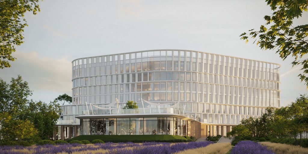
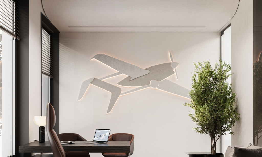
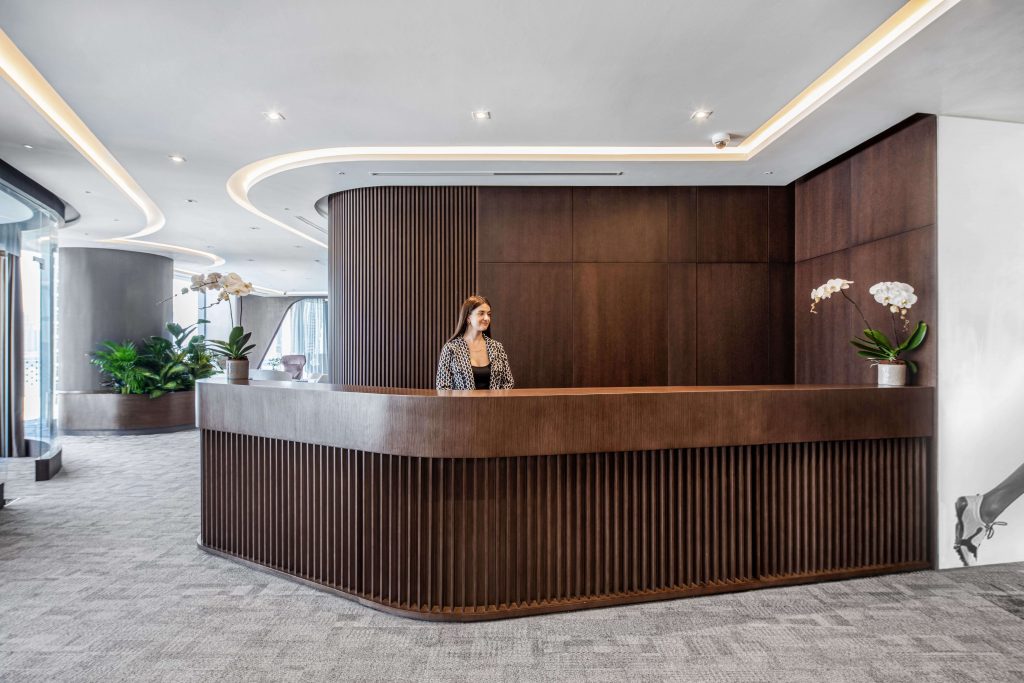
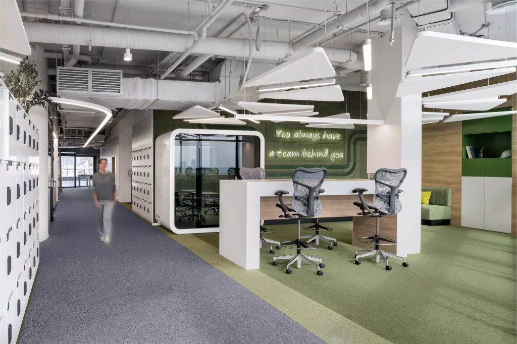
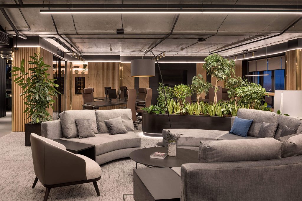
ZIKZAK Architects is a design studio specializing in office design, commercial interior design, and architecture. With a presence in both Ukraine and Cyprus, particularly in the cities of Kyiv and Limassol, our studio has been shaping innovative spaces since 2014. Our architects and interior designers are driven by a passion for design and the creative process. We embrace creativity and innovation as the driving forces behind our designs. We constantly push the envelope, exploring new ideas, materials, and technologies to deliver cutting-edge and impactful interior solutions that leave a lasting impression on our clients. Our clients are at the heart of everything we do. We prioritize their needs, preferences, and aspirations, tailoring our services to provide personalized and customized solutions.
Our goal is to build long-term relationships based on trust, transparency, and exceptional customer experiences, ensuring that every client feels valued and supported throughout their design journey. Our mission is to transform B2B environments into inspiring and functional spaces that enhance productivity, collaboration, and well-being for businesses of all sizes. We strive to create spaces that reflect our client's brand identities while fostering a sense of purpose and pride among their employees. Our aim is to create forward-thinking, sustainable, and future-proof design solutions that meet the evolving needs of businesses in a rapidly changing world.
